Introduction
The purpose of this case study is to explore aspects in reporting state changes of large-scale programmes over time.
A state change in this context refers to the shift in statuses of multiple activities performed during the delivery of a project, the project forming part of a more extensive body programme of works (concentrated portfolio of project activities).
We could attempt this using Excel, and perhaps we’ll be successful as the current dataset only contains c. 60,000 rows and 12 columns, spread roughly equally in 12 spreadsheets.
Generally, reporting change using Excel is difficult. Most analysts typically copy-and-paste the current and a prior version of a reporting snapshot onto separate tabs and then contrast and compare using complicated and nested formulas. Calculations for the respective reporting period is then copied and pasted into another tab.
It is a tall order, and undoubtedly fraught with issues and opportunities to introduce mistakes.
Excel does not scale well
The single biggest issue with using Excel for this type of work is that it does not scale well. Increasing the column and row count n-fold will eventually unleash the spinning wheel of death. If not, then the additional reporting requirements that come with a maturing project will.
This post demonstrates some approaches and techniques using R to transform data and create features to gain insight into state changes of large-scale programmes over time.
Audience
This post targets data analysts and scientists and is equally useful for those interested in the approaches described or using R to analyse these kinds of programmes of works. The key takeaways are similarly valuable and insightful despite it being code-centric.
The approaches and techniques described in this post also suit other industries and programmes, including but not limited to:
- Wind farm projects,
- Chain store refurbishments,
- Network and IT programmes to name a few.
Scenario
In 1994 the African National Congress became South Africa’s ruling governing political party. They pledged to address inequalities caused by years of apartheid, specifically to tackle poverty, focus on education and spreading wealth and opportunity.
In an extract taken from their election manifesto, the ANC promised the following:
The ANC will ensure democratic, efficient and open local government which works closely with community structures in providing affordable housing and services.
We have calculated that, within five years, the new government can:
- build one million homes;
- provide running water and flush toilets to over a million families;
- electrify 2.5-million rural and urban homes.
The fictitious scenario for this case study is a large-scale South African initiative that provided low-cost housing between 2003 and 2011 in selected townships. Township is a local term for an informal settlement.
Please note that references to real companies or initiatives are purely coincidental.
Parts
Part 1 covers setup, importing and exploring base data, providing insights to aid analysis.
Part 2 is concerned with creating and describing functions used for feature engineering.
Part 3 explores the data to reveal aspects, insights of, and commentary about the content.
Part 4. Exception reporting allows users to focus on programme exceptions. Progress and Status reporting provides a snapshot of the current state to date. Prognosis offers an estimate of the future state.
Part 5. In the last part, we evaluate an aspect of supplier performance and consider duration, a measure indicating how long it takes a supplier to complete a task, once the task becomes available to start.
Part 1
Setup
Let’s set up the environment, import and have a look at the data.
Library
package_list <-
  c("tidyverse",
    "lubridate",
    "readxl",
    "knitr",
    "ggrepel",
    "mapdata")

invisible(
  suppressPackageStartupMessages(
    lapply(package_list,
           library,
           character.only = TRUE)
  )
)

rm(package_list)
Parameters & Configuration
The next code block sets up parameters and configures options used throughout the workbook.
# Setting option for digit accuracy
options(digits = 9)

# Specify the location where source files are located
directory_path <- "../../resources/lowcost_housing/"
General Functions
func_remove_spaces <-
  function(.) {

    # transform character fields by replacing underscores with spaces - useful
    # when presenting data
    str_replace_all(string = .,
                    pattern = "_",
                    replacement = " ") %>%
      return()
  }

func_general_date_conversion <-
  function(param_date) {

    # adaptive function to detect the format of a character and coerce data to
    # the correct date/ time
    case_when(
      is.na(param_date) ~ ymd(param_date, quiet = TRUE),
      grepl("\\d{2}\\/\\d{2}\\/\\d{4}", param_date, ignore.case = TRUE) ~ dmy(param_date, quiet = TRUE),
      grepl("\\d{5}", param_date, ignore.case = TRUE) ~ as.Date(suppressWarnings(as.numeric(param_date)), origin = "1899-12-30"),
      TRUE ~ ymd(param_date)
    )
  }
Import
Here we import the data and change the POSIXct data class to a normal date using the lubridate::ymd function to simplify further analysis.
df <-
  read_excel(
    path = paste0(directory_path, "south_african_lowcost_housing_initiative.xlsx")
    ) %>%

  # Simplify datetime values to date only
  mutate_if(is.POSIXct, ymd)
Explore
Where
Map
The following code block maps out geographically where the projects have taken place.
A polygon from the mapdata package plots the outline of South Africa. Township point locations are overlayed onto the polygon, the size of each reflecting the relative volume of houses compared with the entire programme.
# Import the South African polygon from the mapdata package
polygon_zar <- map_data("worldHires", region = "South Africa")

df %>%
  filter_at("Report", all_vars(. == max(.))) %>%

  # group by Township and create a tally/ volume of jobs for each
  group_by(Township) %>%
  summarise(n = n_distinct(Job_Number)) %>%
  inner_join(

    # separate tibble providing a lookup of the lat/ long of the selected
    # townships
    tribble(
      ~ Township, ~ long, ~ lat,
      "Soweto", 27.85849, -26.26781,
      "Khayelitsha", 18.666667,-34.05,
      "Umlazi", 30.8833298, -29.9666628
    ),
    by = "Township"
  ) %>%
  ggplot(aes(x = long,
             y = lat,
             col = Township)) +
  coord_fixed(1.3) +

  # plot the polygon
  geom_polygon(
    data = polygon_zar,
    mapping = aes(x = long, y = lat, group = group),
    color = "grey",
    fill = NA
  ) +

  # cut out extra bits
  ylim(-35,-22) +
  xlim(16, 33) +

  # plot each township, adjusting the size of the point/ shape based on the
  # relative volume of underlying projects
  geom_point(aes(size = n),
             show.legend = FALSE) +
  geom_text(aes(label = Township), size = 5, nudge_y = 0.5,
            show.legend = FALSE) +
  scale_colour_viridis_d() +
  theme_classic() +

  # remove plot axes to improve visualisation
  theme(
    axis.line = element_blank(),
    axis.ticks = element_blank(),
    axis.title = element_blank(),
    axis.text = element_blank()
  )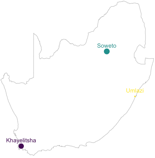
Low-cost housing was delivered in 3 Townships, spread throughout South Africa, located near major cities, including Johannesburg, Durban and Cape Town.
How
Process
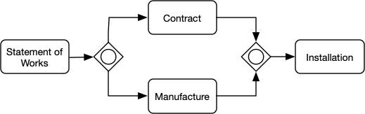
South African low-cost housing Project workflow by major milestones
The process is initiated by a Statement of Works SOW document, committing the delivery of a low-cost house. The completed SOW leads to a contract being drawn up with the house manufactured and installed once legal rights are obtained.
Data
Let’s look at the structure of the data.
df %>%
  # filter report field by returning records with the max date only
  filter_at("Report", all_vars(. == max(.))) %>%

  # coerce character fields as factors
  mutate_if(is.character, factor) %>%

  # return the first 6 observations only
  head() %>%

  # show the structure of the table
  str()
## Classes 'tbl_df', 'tbl' and 'data.frame': 6 obs. of 12 variables:
## $ Report : Date, format: "2010-12-01" "2010-12-01" ...
## $ Job_Number : num 5e+05 5e+05 5e+05 5e+05 5e+05 ...
## $ Township : Factor w/ 3 levels "Khayelitsha",..: 2 3 1 2 1 1
## $ Contract_Supplier : Factor w/ 3 levels "Default","Internal",..: 3 3 3 3 3 3
## $ Installation_Supplier: Factor w/ 5 levels "Fairground & Co",..: 1 5 1 1 4 4
## $ Contract_Forecast : Date, format: "2013-06-13" NA ...
## $ Contract_Actual : Date, format: NA "2005-12-21" ...
## $ Manufacture_Forecast : Date, format: NA NA ...
## $ Manufacture_Actual : Date, format: "2008-11-22" "2007-04-13" ...
## $ Installation_Forecast: Date, format: NA NA ...
## $ Installation_Actual : Date, format: NA "2006-10-23" ...
## $ SOW : Date, format: "2010-11-29" "2010-11-29" ...The structure reveals:
ReportDate when the report was sampled for each month in 2010.Job_NumberUnique reference used to identify the low-cost house being deliveredTownshipThe location where the installation takes placeContract_Supplier:Installation_SupplierName of the suppliers used to deliver aspects of the projectContract_Forecast:Installation_ActualForecast and Actual dates for each of the major Milestones/activity workstreams delivering the project
The data is consolidated snapshot reports of the project state, taken at the date of the report - sampled from each month during 2010.
Each report below contains a nested tibble.
df %>%
  group_by(Report) %>%
  nest()
## # A tibble: 12 x 2
## # Groups: Report [12]
## Report data
## <date> <list>
## 1 2010-01-10 <tibble [5,034 × 11]>
## 2 2010-02-10 <tibble [5,031 × 11]>
## 3 2010-03-11 <tibble [5,027 × 11]>
## 4 2010-04-12 <tibble [5,019 × 11]>
## 5 2010-05-12 <tibble [5,017 × 11]>
## 6 2010-06-10 <tibble [5,016 × 11]>
## 7 2010-07-13 <tibble [5,013 × 11]>
## 8 2010-08-10 <tibble [5,010 × 11]>
## 9 2010-09-08 <tibble [5,008 × 11]>
## 10 2010-10-10 <tibble [5,008 × 11]>
## 11 2010-11-09 <tibble [5,004 × 11]>
## 12 2010-12-01 <tibble [5,004 × 11]>The structure above exposes 4 major milestones in the delivery of a low-cost house. We are interested in last 3 Milestones, namely Contract, Manufacturing and Installation, as per the process described in the How section.
The following code chunk extracts metadata about the Milestones from the source data, including attributes and associated data types.
df %>%

  # return the first observation only
  head(1) %>%

  # map each field's data class
  mutate_all(purrr::map, class) %>%
  unnest(cols = everything()) %>%

  # return the latest report only
  filter_at("Report", all_vars(. == max(.))) %>%

  # select all fields containing the regex shown below, namely all fields to do
  # with the major project milestones
  select(names(.) %>%
           enframe(name = NULL) %>%
           filter(grepl(
             "contract|install|man", value, ignore.case = TRUE
           )) %>%
           pull()) %>%

  # gather all fields into a single column
  gather(Milestone, datatype) %>%

  # separate the Milestone value into two distinct fields
  separate(Milestone, into = c("Milestone", "values")) %>%

  # group by the Milestone and its datatype
  group_by(Milestone, datatype) %>%

  # create a comma delim list of the values, in this case the field variants
  # (suffix) of the Milestone
  summarise_at(vars(values), toString) %>%

  # set presentation options when outputting as table
  kable(format = "html") %>%
  kableExtra::kable_styling(full_width = FALSE, font_size = 12) %>%
kableExtra::collapse_rows(columns = 1, valign = "top")| Milestone | datatype | values |
|---|---|---|
| Contract | character | Supplier |
| Date | Forecast, Actual | |
| Installation | character | Supplier |
| Date | Forecast, Actual | |
| Manufacture | Date | Forecast, Actual |
All 3 milestones have Forecast and Actual dates, with fields capturing the Contract and Supplier names responsible for performing each activity.
The Forecast date is when the activity is planned to be delivered by, whereas Actual is when the activity had been completed.
The Milestone Status is derived from these values, including:
ActualThe activity is completed and claimed ActualForecastThe activity is planned/ forecasted to occur in the futureDIP‘Date in the Past’ is a planned activity which has lapsedNo ForecastThere is no planned date for delivery of the activity
These values are returned by the Milestone Status field, described and calculated within the Feature Engineering section below.
Part 2: Feature Engineering
This section instantiates functions used to transform data and create new features.
Functions are explained in the following section.
Functions to create Features
func_set_milestone_levels <-
  function(.) {
    factor(
      x = .,
      levels = c("Contract", "Manufacture", "Installation"),
      ordered = TRUE
    ) %>%
      return()
  }

func_add_milestone_matrix <-
  function(df) {
    df %>%
      names() %>%
      enframe(name=NULL) %>%
      filter(grepl("_Forecast$|_Actual$", value, ignore.case = TRUE)) %>%
      mutate(Milestone = str_remove(
        string = value,
        pattern = "_Forecast$|_Actual$"
      )) %>%
      mutate(Status = case_when(
        grepl("_Forecast", value, ignore.case = TRUE) ~ "Forecast",
        grepl("_Actual", value, ignore.case = TRUE) ~ "Actual",
        TRUE ~ "Other"
      )) %>%
      group_by(Milestone) %>%
      mutate(instances = n_distinct(value)) %>%
      spread(Status, value)
  }

func_add_ms_long <-
  function(Report, milestone_matrix, df) {
    fun_create_status <-
      function(milestone_date) {
        df %>%
          select(row_id, Milestone_Date = all_of(milestone_date)) %>%
          mutate_at(vars(Milestone_Date), func_general_date_conversion) %>%
          return()
      }

    milestone_matrix %>%
      pivot_longer(cols = Actual:Forecast,
                   names_to = "Milestone_Status",
                   values_to = "Milestone_Status_Field") %>%
      filter(!is.na(Milestone_Status_Field)) %>%
      mutate(data = purrr::map(Milestone_Status_Field, fun_create_status)) %>%
      select(-Milestone_Status_Field) %>%
      unnest(data) %>%
      pivot_wider(names_from = Milestone_Status, values_from = Milestone_Date) %>%
      mutate(
        Milestone_Status = case_when(
          !is.na(Actual) ~ "Actual",
          !is.na(Forecast) & Forecast >= Report ~ "Forecast",
          !is.na(Forecast) ~ "DIP",
          is.na(Forecast) ~ "No Forecast",
          TRUE ~ "Other"
        )
      ) %>%
      mutate(
        Milestone_Date = coalesce(Actual, Forecast),
        Milestone_Completed = !is.na(Actual)
      ) %>%
      return()
  }

func_add_ms_wide <-
  function(ms_long) {
    create_milestone_attribute <-
      function(milestone_attribute) {
        milestone_attribute_sub_name <-
          sub("\\w+\\_(\\w+)",
              "\\1",
              rlang::quo_text(milestone_attribute))

        ms_long %>%
          ungroup() %>%
          select(Milestone, row_id,!!milestone_attribute) %>%
          mutate_at(vars(Milestone),
                    ~ paste(., milestone_attribute_sub_name, sep = "_")) %>%
          spread(Milestone,!!milestone_attribute) %>%
          return()
      }

    tibble(Milestone_Attribute = list(
      quo(Milestone_Date),
      quo(Milestone_Status),
      quo(Milestone_Completed)
    )) %>%
      mutate(data = pmap(
        list(milestone_attribute = Milestone_Attribute),
        create_milestone_attribute
      )) %>%
      pull(data) %>%
      reduce(inner_join, by = "row_id") %>%
      return()
  }
Create Features
The source data is passed through the functions listed above, resulting in the creation of 3 new tibbles for each report, each a derivative of the project state snapshot.
df_enhanced <-
  df %>%

  # create a row identifier for each observation
  mutate(row_id = row_number()) %>%

  # group by Report and nest associated data within the file column
  group_by(Report) %>%
  nest() %>%
  rename(file = data) %>%

  # map the file tibble for each report to the func_add_milestone_matrix
  # function to extract Milestones and associated fields
  mutate(milestone_matrix = purrr::map(file, func_add_milestone_matrix)) %>%

  # map newly created milestone matrix to the file and extract new milestone
  # features for each milestone
  mutate(ms_long = pmap(list(Report, milestone_matrix, file), func_add_ms_long)) %>%

  # transform elongated ms_long to ms_wide
  mutate(ms_wide = purrr::map(ms_long, func_add_ms_wide))
Explore Features
The section below explores each one of the three newly created tibbles described above.
Milestone Matrix
The Milestone Matrix is an automatic extract of each of the milestones contained within the source data. The func_add_milestone_matrix function returns all fields that end with Forecast and/ or Actual, isolating the Milestone name and listing the fields required to provide the Forecast and Actual dates respectively. These fields are used contextually to create Milestone related features.
df_enhanced %>%

  # return first observation only
  head(1) %>%

  # select and unnest the milestone_matrix
  ungroup() %>%
  select(milestone_matrix) %>%
  unnest(milestone_matrix) %>%

  # set presentation options for the table
  kable(format = "html") %>%
kableExtra::kable_styling(full_width = FALSE, font_size = 11)| Milestone | instances | Actual | Forecast |
|---|---|---|---|
| Contract | 2 | Contract_Actual | Contract_Forecast |
| Installation | 2 | Installation_Actual | Installation_Forecast |
| Manufacture | 2 | Manufacture_Actual | Manufacture_Forecast |
Milestone Long
Milestone Long creates a long format of the data, providing tidy data and simplified features better suited for further analysis.
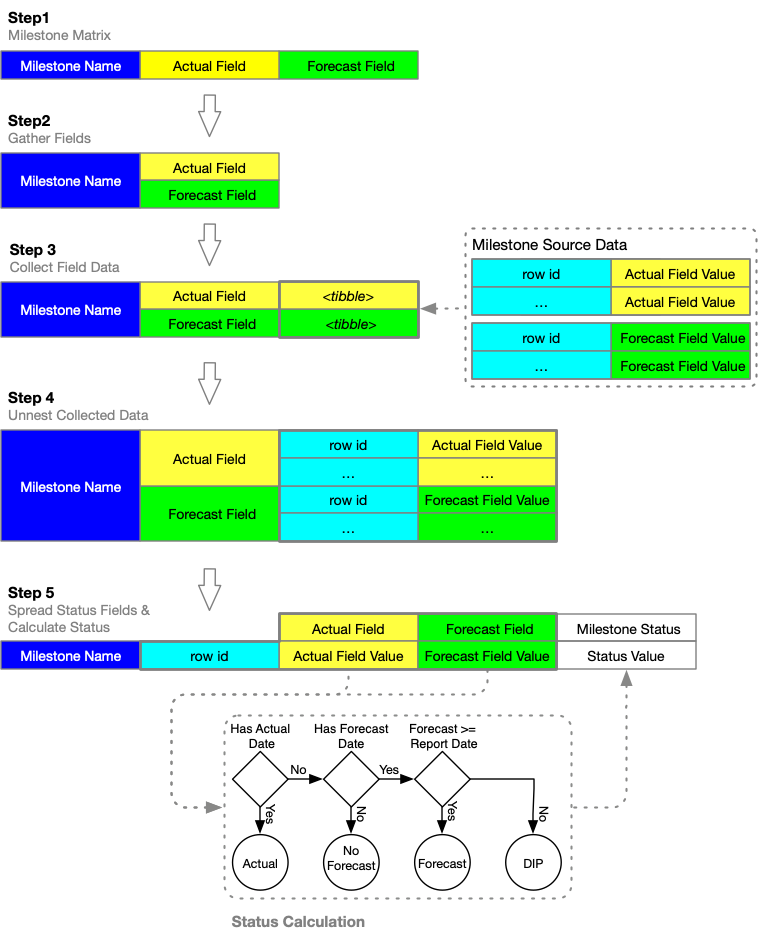
The following flow diagram captures the sequence of steps performed by the func_add_ms_long function.
Milestone Long Process
Describing the Milestone Long Process diagram:
Step 1
The func_add_ms_long function takes as input the tibble generated by the func_add_milestone_matrix function, as described in the Milestone Matrix section.
Step 2
The Forecast and Actual field names are gathered into one field, representing a list of all date fields to be collected for each combination of Job_Number/ row_id and Milestone.
Step 3
Step 3 creates containers for each of the date fields, querying values from the source data and populating the containers with all relevant records as nested tibbles.
Step 4
Collected data in the nested tibbles are unnested, exposing values to be consumed by functions generating new milestone-related features.
Step 5
Forecast and Actual values for each row_id and Milestone are spread into a single observation. New fields, namely Milestone_Status, Milestone_Date and Milestone_Completed are calculated, using the Forecast, Actual and Report dates as input.
The following code chunk returns the head of the unnested ms_long tibble.
df_enhanced %>%

  # select the last nested tibble
  tail(1) %>%

  # select and unnest the ms_long tibble
  ungroup() %>%
  select(ms_long) %>%
  unnest(ms_long) %>%

  # return the head of the unnested tibble
  head() %>%

  # rename the fields for presentation purposes
  rename_all(func_remove_spaces) %>%

  # configure the table formatting output
  kable(format = "html") %>%
  kableExtra::kable_styling(full_width = FALSE, font_size = 11) %>%
  kableExtra::column_spec(1:2, bold = TRUE) %>%
kableExtra::collapse_rows(columns = 1:2, valign = "top")| Milestone | instances | row id | Actual | Forecast | Milestone Status | Milestone Date | Milestone Completed |
|---|---|---|---|---|---|---|---|
| Contract | 2 | 55188 | NA | 2013-06-13 | Forecast | 2013-06-13 | FALSE |
| 55189 | 2005-12-21 | NA | Actual | 2005-12-21 | TRUE | ||
| 55190 | 2008-09-29 | NA | Actual | 2008-09-29 | TRUE | ||
| 55191 | 2007-07-31 | NA | Actual | 2007-07-31 | TRUE | ||
| 55192 | 2007-08-26 | NA | Actual | 2007-08-26 | TRUE | ||
| 55193 | 2007-12-10 | NA | Actual | 2007-12-10 | TRUE |
Milestone Wide
The func_add_ms_wide takes the product of the func_add_ms_long function as input.
The purpose of the function is to widen the elongated table, taking the ms_long tibble for each row_id and transforming it into a single observation per Job_Number or row_id, the milestone-related data spread across it.
func_order_by_ms <-
  function(df) {

    # ensures Milestone related fields are grouped by sequential milestones
    tmp <-
      df %>%
      names() %>%
      enframe(name = NULL) %>%
      mutate(field = value) %>%
      mutate_at(vars(value), str_remove, pattern = "_Status|_Completed|_Date") %>%
      mutate_at(vars(value), func_set_milestone_levels) %>%
      arrange(value) %>%
      pull(field) %>%
      return()

    df %>%
      select(row_id, all_of(tmp)) %>%
      return()
  }

# return the table tail, grouping features for each Milestone
df_enhanced %>%
  tail(1) %>%
  ungroup() %>%
  select(ms_wide) %>%
  unnest(ms_wide) %>%
  head() %>%

  # pass df through function to ensure that fields are ordered by Milestone
  func_order_by_ms() %>%

  # rename fields and configure table presentation options
  rename_all(func_remove_spaces) %>%
  kable(format = "html") %>%
  kableExtra::kable_styling(full_width = FALSE, font_size = 9) %>%
  kableExtra::add_header_above(c(
  "",
  "Contract" = 3,
  "Manufacture" = 3,
  "Installation" = 3
  )) %>%
kableExtra::scroll_box(width = "100%", height = "200px")| row id | Contract Date | Contract Status | Contract Completed | Manufacture Date | Manufacture Status | Manufacture Completed | Installation Date | Installation Status | Installation Completed |
|---|---|---|---|---|---|---|---|---|---|
| 55188 | 2013-06-13 | Forecast | FALSE | 2008-11-22 | Actual | TRUE | NA | No Forecast | FALSE |
| 55189 | 2005-12-21 | Actual | TRUE | 2007-04-13 | Actual | TRUE | 2006-10-23 | Actual | TRUE |
| 55190 | 2008-09-29 | Actual | TRUE | 2010-05-30 | Actual | TRUE | 2010-06-03 | Actual | TRUE |
| 55191 | 2007-07-31 | Actual | TRUE | 2009-03-05 | Actual | TRUE | 2009-05-21 | Actual | TRUE |
| 55192 | 2007-08-26 | Actual | TRUE | 2009-01-18 | Actual | TRUE | 2008-02-05 | Actual | TRUE |
| 55193 | 2007-12-10 | Actual | TRUE | 2005-10-20 | Actual | TRUE | 2008-05-08 | Actual | TRUE |
The table above is a simplified and formatted extract of the unnested ms_wide tibble.
The wide table is very useful for users wishing to analyse data using Excel pivot tables for example.
df_enhanced %>%
  tail(1) %>%
  ungroup() %>%
  select(ms_wide) %>%
  unnest(ms_wide) %>%

  # pass df through function to ensure that fields are ordered by Milestone
  func_order_by_ms() %>%
  group_by_at(c(
    "Contract_Completed",
    "Manufacture_Completed",
    "Installation_Completed"
  )) %>%
  summarise(jobs = n_distinct(row_id)) %>%
  ungroup() %>%
  mutate(ratio = jobs / sum(jobs)) %>%
  arrange_if(is.logical) %>%
  rename_all(func_remove_spaces) %>%
  kable(format = "html", digits = 2) %>%
  kableExtra::kable_styling(full_width = FALSE, font_size = 10) %>%
kableExtra::collapse_rows(columns = 1:3, valign = "top")| Contract Completed | Manufacture Completed | Installation Completed | jobs | ratio |
|---|---|---|---|---|
| FALSE | FALSE | FALSE | 69 | 0.01 |
| TRUE | 28 | 0.01 | ||
| TRUE | 1 | 0.00 | ||
| TRUE | FALSE | FALSE | 119 | 0.02 |
| TRUE | 18 | 0.00 | ||
| TRUE | FALSE | 79 | 0.02 | |
| TRUE | 4690 | 0.94 |
Part 3: Exploratory Data Analysis
In this section, we are diving into the detail and reveal aspects of the content.
The next code block gets this going by creating a very simple tally of completed Milestones by snapshot report. It uses the newly created Milestone_Completed boolean value contained within the ms_long tibble, coercing it as an integer when summarised by sum.
df_enhanced %>%
  ungroup() %>%
  unnest(ms_long) %>%

  # coerce Milestone to factor to ensure the reported order follows the process
  mutate_at(
    "Milestone",
    factor,
    levels = c("Contract", "Manufacture", "Installation"),
    ordered = TRUE
  ) %>%

  # group by Milestone and Report
  group_by(Milestone, Report) %>%

  # create a tally of the completed activities
  summarise_at(vars(Milestone_Completed), sum) %>%

  # spread the Milestone complete count
  spread(Milestone, Milestone_Completed) %>%

  # return the head of the result
  head() %>%

  # set presentation options
  rename_all(func_remove_spaces) %>%
  kable(format = "html") %>%
kableExtra::kable_styling(full_width = FALSE, font_size = 12)| Report | Contract | Manufacture | Installation |
|---|---|---|---|
| 2010-01-10 | 4843 | 4363 | 4108 |
| 2010-02-10 | 4858 | 4415 | 4205 |
| 2010-03-11 | 4881 | 4452 | 4242 |
| 2010-04-12 | 4898 | 4500 | 4317 |
| 2010-05-12 | 4900 | 4564 | 4382 |
| 2010-06-10 | 4907 | 4613 | 4455 |
The above table serves as a great example of why many find it difficult to digest tabular data. Spotting trends, patterns, change and differences are more obvious when the data is visualised. Let’s try again, this time visualising the data.
The following graph is generated from a compilation of reports, sampled within each month of 2010. It provides excellent source data to demonstrate state changes in various activities between consecutive report versions.
The next code block transforms the data making it suitable for graphing.
plot_data <-
  df_enhanced %>%

  # unnest the ms_long tibble for each report
  ungroup() %>%
  unnest(ms_long) %>%

  # coerce the Milestones as factors to ensure order
  mutate_at(
    "Milestone",
    factor,
    levels = c("Contract", "Manufacture", "Installation"),
    ordered = TRUE
  ) %>%

  # create a tally for each Milestone/ Report, automatically coercing the
  # boolean `Milestone_Completed` value to numeric
  group_by(Milestone, Report) %>%
  summarise_at(vars(Milestone_Completed), sum) %>%

  # extract the lagged value of the Milestone Completed
  mutate_if(is.numeric, list(lag = lag)) %>%

  # calculate tally change from one report to the next
  mutate(Change = Milestone_Completed - lag) %>%
  select(-lag) %>%

  # remove all observations if any field has NA values
  filter_all(all_vars(! is.na(.))) %>%

  # rename field for reporting purposes
  rename(Completed = Milestone_Completed) %>%

  # gather the newly created values into a single column
  pivot_longer(cols = Completed:Change, names_to = "Metric", values_to = "value") %>%

  # order the newly created Metric values by coercing as factor
  mutate_at(vars(Metric), factor, levels = c("Completed", "Change"), ordered = TRUE)
## `mutate_if()` ignored the following grouping variables:
## Column `Milestone`The following section consumes plot_data and plots a visualisation.
plot_data %>%
  filter(Metric == "Completed") %>%
  ggplot(aes(
    x = Report,
    y = value,
    label = value,
    col = Milestone
  )) +
  geom_line(size = 1,
            show.legend = TRUE) +
  geom_label(
    data = plot_data %>%
      filter(Metric == "Completed") %>%
      group_by(Milestone) %>%

      # showing cumulative tally for the last values only
      filter(Report == max(Report)),
    aes(fill = Milestone),
    col = "white",
    size = 3.5,
    show.legend = FALSE
  ) +
  geom_col(data = plot_data %>%
             filter(Metric == "Change"),
           aes(fill = Milestone),

           # Dodge puts the columns next to each other for each date rather than
           # stacking, which is the default
           position = "dodge",
           show.legend = TRUE) +

  # geom_label_repel taken from ggrepel package, spacing labels to avoid overlap
  geom_label_repel(
    data = plot_data %>%
      filter(Metric == "Change"),
    aes(label = value),
    size = 2.5,
    show.legend = FALSE
  ) +
  scale_x_date(date_breaks = "3 month", date_labels = "%b-%y") +

  # facet Metrics in order to create two sections, one for net and the other for
  # cumulative tally for each milestone
  facet_grid(Metric ~ ., scales = "free") +
  theme_classic() +
  theme(legend.position = "bottom",
        legend.key.size = unit(0.5, "cm")) +
  labs(title = "South African low-cost housing Project",
       subtitle = "Major Milestones state changes for reports in 2010",
       y = "Units Completed")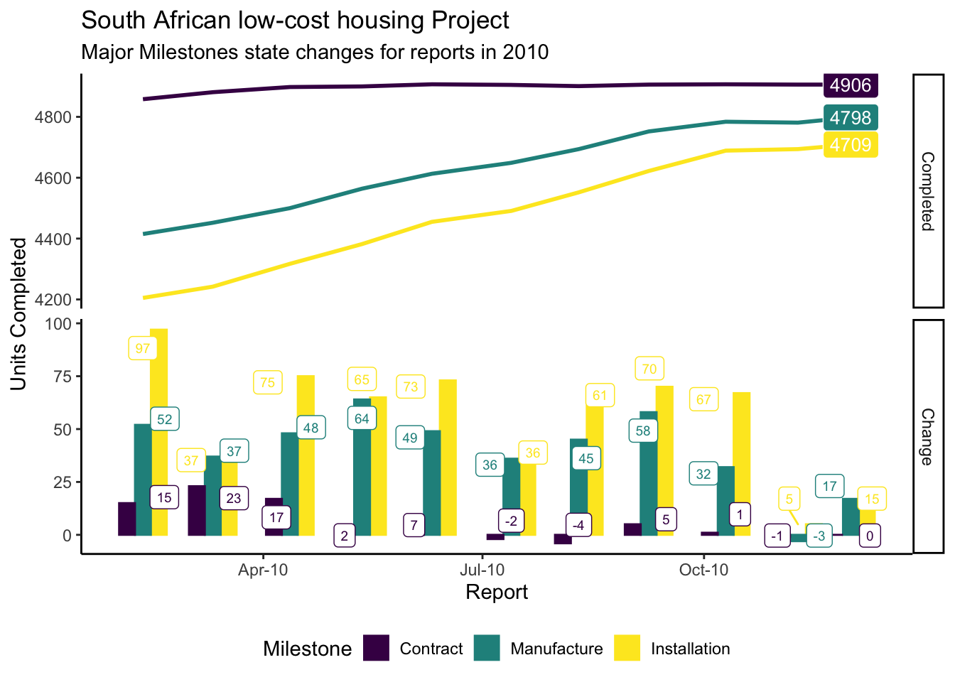
Commentary
Notes about the rate of change as gleaned from the slope of the line graphs:
- Rate Increase: Positive slope1
- Rate Decrease: Negative slope
- The steeper the angle, the higher the rate of change
The slope of the upper-most curve suggests that the Contract activity rate of delivery has flattened out during 2010. The other two activities are catching up, mainly running in parallel, consuming the pot of Contract not Installed.
The Manufactured not Installed pot is also getting smaller, suggesting that there is not much of a lag between Manufacture and Installation activities.
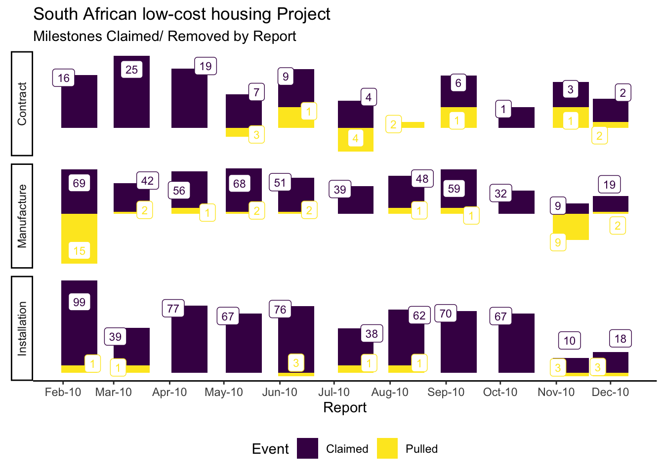
Some milestones have been removed (negative net change values) after July. This is because of quality issues, symptomatic of an aggressive push to achieve volume targets without scaling resource to meet demand - resulting in corners being cut. Milestones are subsequently removed until work is completed to specification, as it may otherwise trigger payments and/ or allow the project to proceed without the necessary quality in place.
Let’s look at the same data, now taken from the latest version of the report, and focus on milestone delivery between 2006 and 2010.
plot_data <-
  df_enhanced %>%
  unnest(ms_long) %>%
  mutate_at(
    vars(Milestone),
    factor,
    levels = c("Contract", "Manufacture", "Installation"),
    ordered = TRUE
  ) %>%

  # filter to include data from the latest Report only
  filter_at(vars(Report), all_vars(. == max(.))) %>%

  # filter where milestones had been claimed as Actual
  filter(Milestone_Completed) %>%
  select(Milestone, Milestone_Date, row_id) %>%

  # transform dates to the start of the week
  mutate_at(vars(Milestone_Date),
            floor_date,
            unit = "week",

            # Monday set as the first day of the week
            week_start = 1) %>%

  # group by Milestone and Week and summarise a distinct count of Jobs
  group_by(Milestone, Milestone_Date) %>%
  summarise(Jobs = n_distinct(row_id)) %>%
  arrange(Milestone_Date) %>%
  mutate_at(vars(Jobs), cumsum) %>%

  # filter to keep Jobs delivered after 2005 only
  filter(year(Milestone_Date) > 2005) %>%

  # calculate the change in tally from one report to the next
  mutate(Change = Jobs - lag(Jobs)) %>%

  # calculate the rolling mean, spread over 4 weeks
  mutate_at(
    vars(Change),
    list(Change_rm4 = zoo::rollmean),
    k = 4,
    align = "right",
    fill = NA
  ) %>%

  # create a variable to represent the scaled tally
  mutate_if(is.numeric, list(scale = scale)) %>%

  # filter to retain rows where all columns are populated
  filter_if(is.numeric, all_vars(! is.na(.)))
## Adding missing grouping variables: `Report`## `mutate_if()` ignored the following grouping variables:
## Column `Milestone`plot_data %>%
mutate(Aspect = "Rate of Change [Scaled]") %>%
ggplot(
aes(
x = Milestone_Date,
y = Change_rm4_scale,
group = Milestone,
col = Milestone,
fill = Milestone
)
) +
geom_line(
data = plot_data %>%
mutate(Aspect = "Cumulative Units Completed"),
aes(y = Jobs),
size = 1.5
) +
# plot the rate of change, using loess smoothing
geom_smooth(
method = 'loess',
size = 1,
lty = 3
) +
scale_colour_viridis_d() +
# facet the aspects, including change and cumulative completed
facet_grid(Aspect ~ ., scales = "free", switch = "y") +
# change the x-axis values to show year breaks
scale_x_date(date_breaks = "year", date_labels = "%Y") +
theme_classic() +
theme(legend.position = "bottom",
strip.placement = "outside",
strip.background = element_blank()) +
labs(title = "South African low-cost housing Project",
subtitle = "Major Milestones cumulative progress & rate-of-change to date from 2006 onwards",
x = "Year",
y = "")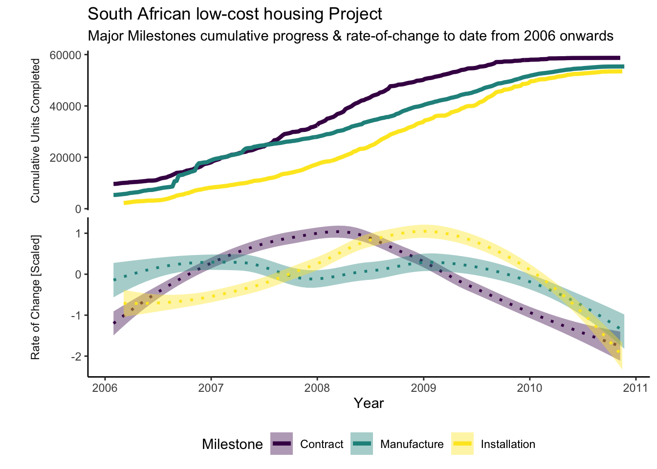
Commentary Continued
The cumulative delivery of manufactured housing overtook Contracts during 2007. It is most likely that Manufacturing built up a large pot in anticipation of contracts being completed. However, this investment was never converted as Installation did not show a corresponding step change during or after this period of increased activity. This indicates that it was not possible to install the newly manufactured houses without completed contracts. The Contract team would have been under pressure to increase output.
The rate of delivery in Contracts, however, increased in the 2 years following this event. I suspect that it had achieved critical mass after accruing latent potential during the previous 3 years of activity, subsequently yielding a higher and sustained throughput.
The above graph reveals that Manufacturing was throttled after peaking prematurely and that the Installation peak followed within 6 months of that of Contracts.
Part 4: Reporting Exceptions, Progress & Status and Prognosis
Exception reporting allows users to concentrate on programme exceptions. It becomes a challenge to focus on relevant and current issues when presented with a sea of data, so cutting to the heart of prioritised issues and opportunities are hugely efficient and effective.
Progress and Status reporting provides a snapshot of the current state to date, which is especially useful if coupled with targets and performance indicators.
Prognosis offers an estimate of the future state, allowing the users to anticipate and prepare.
Getting Ready for reporting
Let’s prepare some joined tibbles and functions to inspect the data.
Join
The following code chunk creates df_enhanced_long, a joined dataset between the original file import and the newly created milestone specific extract, ms_long.
Creating this streamlines subsequent analysis.
df_enhanced_file <-
  df_enhanced %>%
  ungroup() %>%

  # unnest file
  select(file, Report) %>%
  unnest(file)

df_enhanced_ms_long <-
  df_enhanced %>%
  ungroup() %>%

  # unnest file
  select(ms_long, Report) %>%
  unnest(ms_long)

df_enhanced_long <-
  df_enhanced_file %>%
  # join unnested ms_long
  inner_join(df_enhanced_ms_long, by = c("Report", "row_id")) %>%

  # create new feature to map supplier to relevant Milestone
  mutate(
    Milestone_Supplier = case_when(
      Milestone == "Contract" ~ Contract_Supplier,
      Milestone == "Installation" ~ Installation_Supplier,
      TRUE ~ "Internal"
    ) %>%

      # make missing Milestone_Supplier explicit
      coalesce(., "Unknown")
  )
Functions to create Features
In the following block of code, we create parameters and functions to reuse in Supplier reporting, ensuring continuity in the use of colours between graphs.
param_supplier_viridis <-
  tibble(
    Supplier =
      df_enhanced_long %>%
      filter(!is.na(Milestone_Supplier)) %>%
      distinct(Supplier = Milestone_Supplier) %>%
      add_case(Supplier = "All Installation") %>%
      arrange(Supplier) %>%
      pull(),
    col = viridis::cividis(n = 9)
  )

plot_data_viridis <-
  function() {
    plot_data %>%
      distinct(Supplier) %>%
      mutate_all(as.character) %>%
      left_join(param_supplier_viridis, by = "Supplier") %>%
      mutate_at(vars(Supplier), fct_inorder)
  }
Milestones Claimed & Pulled
This code block teases out the milestones that have been claimed or removed (aka pulled).
This is achieved by comparing subsequent versions of reports, each with detail about underlying jobs and milestones, and extracting and categorising differences between these.
plot_data <-
  df_enhanced_long %>%
  select(Job_Number, Report, Milestone, Status_Current = Milestone_Completed) %>%
  mutate_at(
    "Milestone",
    factor,
    levels = c("Contract", "Manufacture", "Installation"),
    ordered = TRUE
  ) %>%

  # group by Job and Milestone
  group_by(Job_Number, Milestone) %>%

  # create a new feature showing the lagged status
  mutate(Status_Previous = lag(Status_Current, order_by = Report)) %>%

  # filter out where the status is different between versions of the report
  filter(Status_Current != Status_Previous) %>%

  # create a new feature to categorise change scenarios, discarding other
  # variables
  transmute(
    Scenario = case_when(
      Status_Current ~ "Milestone_Claimed",
      Status_Previous ~ "Milestone_Pulled",
      TRUE ~ "Other"
    ),
    Report = Report
  ) %>%
  ungroup()

plot_data %>%
  mutate_at(vars(Scenario), str_remove, pattern = "Milestone_") %>%
  group_by(Report, Milestone, Scenario, Report) %>%
  summarise(n = n_distinct(Job_Number)) %>%
  group_by(Scenario) %>%

  # create variable nn to change the scale of reporting between Scenarios to
  # improve visualisation
  mutate(nn = (n - min(n)) / (max(n) - min(n))) %>%
  mutate(nn = if_else(Scenario == "Pulled", (nn * -1) + 0.1, nn + 0.1)) %>%

  ggplot(aes(x = Report, y = nn, fill = Scenario)) +
  geom_col() +
  geom_label_repel(aes(label = n, col = Scenario),
                   fill = "white",
                   size = 3,
                   show.legend = FALSE) +

  # formatting options below
  scale_x_date(date_breaks = "1 month", date_labels = "%b-%y") +
  scale_fill_viridis_d() +
  scale_colour_viridis_d() +
  theme_classic() +
  facet_grid(Milestone ~ ., scales = "free", switch = "y") +
  theme(
    axis.line.y = element_blank(),
    axis.title.y = element_blank(),
    axis.text.y = element_blank(),
    axis.ticks.y = element_blank(),
    legend.position = "bottom"
  ) +

  # labelling
  labs(
    title = "South African low-cost housing Project",
    subtitle = "Milestones Claimed/ Removed by Report",
    fill = "Event"
  )
Jobs removed from Project
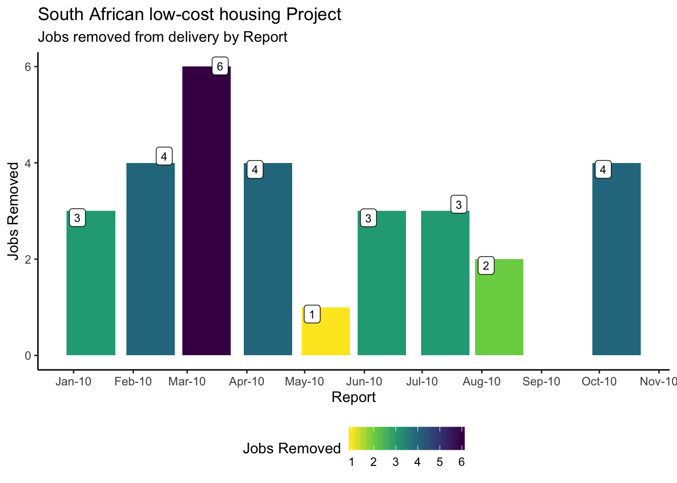
Here we identify jobs that are removed from delivery, using the approach described above.
plot_data <-
  df_enhanced_long %>%

  # select job_number and report
  select(Job_Number, Report) %>%

  # create new features showing the first and last report
  mutate_at(vars(Report), list(
    Report_first = ~ first(., order_by = .),
    Report_last = ~ last(., order_by = .)
  )) %>%

  # group by job_number
  group_by(Job_Number) %>%

  # now create features showing the first and last report for each job_number
  mutate_at(vars(Report),
            list(
              Job_Report_first = ~ first(., order_by = .),
              Job_Report_last = ~ last(., order_by = .)
            )) %>%
  ungroup() %>%

  # filter job_numbers that aren't in the last report
  filter(Job_Report_last != Report_last) %>%
  distinct(Job_Report_last, Job_Number) %>%

  # group by Reports
  group_by(Report = Job_Report_last) %>%

  # create a tally of removed jobs by Report
  summarise(n = n_distinct(Job_Number))

plot_data %>%
  ggplot(aes(x = Report, y = n, fill = n)) +
  geom_col() +
  geom_label_repel(aes(label = n),
                   fill = "white",
                   size = 3,
                   show.legend = FALSE) +
  scale_x_date(date_breaks = "1 month", date_labels = "%b-%y") +
  scale_fill_viridis_c(direction = -1) +
  theme_classic() +
  theme(legend.position = "bottom") +
  labs(
    x = "Report",
    y = "Jobs Removed",
    title = "South African low-cost housing Project",
    subtitle = "Jobs removed from delivery by Report",
    fill = "Jobs Removed"
  )
Current Progress & Forecast
The next section explores the progress to date and the forecast for each milestone as it was at the end of 2010 when the last snapshot report was sampled.
plot_data <-
  df_enhanced_long %>%
  ungroup() %>%

  # filter to retain data from the last report only
  filter(Report == max(Report)) %>%

  # filter to retain forecast and actual Milestone Statusses only
  filter(Milestone_Status %in% c("Forecast", "Actual")) %>%
  select(Report, Job_Number, Milestone, Milestone_Status, Milestone_Date) %>%

  # create a hard floor and ceiling for the dates outside the reporting range
  mutate_at(vars(Milestone_Date),
            ~ case_when(
              . < ymd("2009-01-01") ~ ymd("2009-01-01"),
              . > ymd("2011-12-31") ~ ymd("2011-12-31"),
              TRUE ~ .
            )) %>%

  # transform dates to the start of a month
  mutate_at(vars(Milestone_Date), floor_date, week_start = 1, unit = "month") %>%

  # calculate a tally for groups of Milestone, Status and Month
  group_by(Report, Milestone, Milestone_Status, Milestone_Date) %>%
  summarise(net = n_distinct(Job_Number)) %>%

  # group and create a cumulative tally of net
  group_by(Milestone) %>%
  mutate_at(vars(net), list(cum = cumsum)) %>%

  # filter data to start at a year's worth of data before the last report
  filter(Milestone_Date > Report - years(1)) %>%

  # gather net and cum into one column, making it easier to visualise
  pivot_longer(cols = net:cum,
               names_to = "Metric",
               values_to = "Value") %>%
  ungroup() %>%
  mutate_at(
    vars(Milestone),
    factor,
    levels = c("Contract", "Manufacture", "Installation"),
    ordered = TRUE
  )
Now plot the data.
plot_data %>%
  filter(Metric == "net") %>%
  ggplot(aes(x = Milestone_Date, y = Value, fill = Milestone)) +
  geom_col(position = "dodge") +
  geom_line(
    data = plot_data %>%
      filter(Metric == "cum"),
    aes(y = Value, col = Milestone, lty = Milestone_Status),
    size = 1,
    show.legend = TRUE
  ) +

  # Label Actual
  geom_label_repel(
    data = plot_data %>%
      filter(Milestone_Status == "Actual") %>%
      filter(Metric == "cum") %>%
      group_by(Milestone) %>%
      filter_at("Milestone_Date", all_vars(. == max(.))),
    aes(
      y = Value,
      label = Value
      ),
    col = "white",
    size = 3.5,
    show.legend = FALSE
  ) +

  # Label Forecast
  geom_label_repel(
    data = plot_data %>%
      filter(Milestone_Status == "Forecast") %>%
      filter(Metric == "cum") %>%
      group_by(Milestone) %>%
      filter_at("Milestone_Date", all_vars(. == max(.))),
    aes(
      y = Value,
      label = Value,
      col = Milestone
      ),
    fill = "white",
    size = 3.5,
    show.legend = FALSE
  ) +
  scale_x_date(date_breaks = "3 month", date_labels = "%b-%y") +
  facet_grid(Metric ~ ., scales = "free_y") +
  scale_colour_viridis_d() +
  scale_fill_viridis_d() +
  theme_classic() +
  labs(
    x = "Month",
    y = "Units Completed",
    lty = "Status",
    title = "South African low-cost housing Project",
    subtitle = "Major Milestones by Progress + Forecast"
    )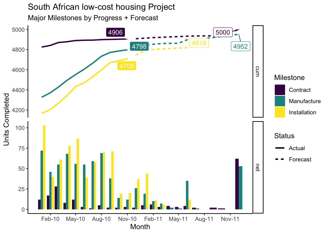
The cum (cumulative) facet shows the cumulative progress to date, punctuated by the solid label. The Forecast plotlines extend the current progress to date for each milestone to show cumulative forecast, punctuated by a clear label with the forecasted tally.
The net facet shows the new volume per Milestone per month. The large bars at the end of 2011 mostly represent activities forecasted beyond 2011.
Part 5: Evaluating Performance
Evaluating supplier performance is a cornerstone of contractual reporting, especially when terms may result in financial or other penalties and rewards.
Here we consider duration, a measure indicating how long it takes a supplier to complete a task, once the task becomes available to start.
It is a performance measure that is particularly suitable for time-critical activities.
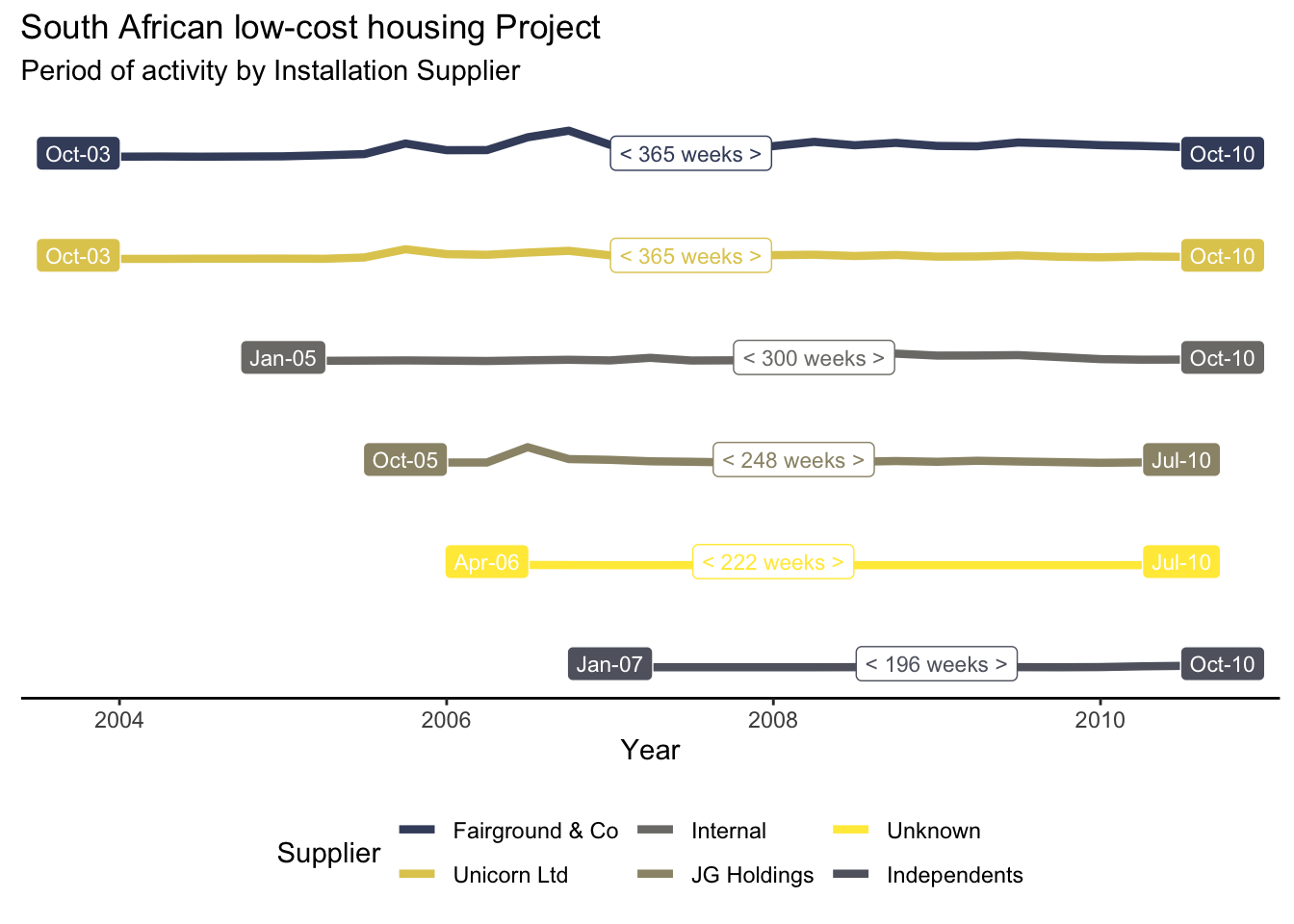
Supplier Tenure
Supplier tenure shows when Installation suppliers started and were last active on the programme. Line ends are punctuated by the start and end dates respectively
This view provides valuable insights into the performance of suppliers, as explored in the Evaluating Performance - Duration section.
plot_data <-
  df_enhanced_long %>%

  # rename Installation_Supplier to Supplier so simplify the plot
  rename(Supplier = Installation_Supplier) %>%

  # code missing Supplier with `unknown`
  mutate_at(vars(Supplier), ~ coalesce(., "Unknown")) %>%

  # filter to keep latest report, completed Manufacture milestone
  filter_at(vars(Report), all_vars(. == max(.))) %>%
  filter(Milestone == "Manufacture",
         Milestone_Completed) %>%
  select(Milestone_Date, row_id, Supplier) %>%

  # transform the date to the start of a quarter
  mutate_at(vars(Milestone_Date),
            list(floor_date),
            week_start = 1,
            unit = "quarter") %>%

  # count the combinations of a quarter and supplier
  count(Milestone_Date, Supplier) %>%

  # scale the count
  mutate_at(vars(n), scale) %>%

  # order the suppliers
  mutate_at(vars(Supplier), fct_inorder)

plot_data %>%
  ggplot(aes(x = Milestone_Date, y = n, col = Supplier)) +
  geom_freqpoly(stat = "identity",
                size = 1.5) +
  geom_label(
    data =
      plot_data %>%
      group_by(Supplier) %>%
      summarise_at(vars(Milestone_Date), list(min = min, max = max)) %>%
      pivot_longer(
        cols = -Supplier,
        names_to = "Approach",
        values_to = "Milestone_Date"
      ),
    aes(
      label = format(Milestone_Date, "%b-%y"),
      y = 0,
      fill = Supplier
    ),
    col = "white",
    size = 3,
    show.legend = FALSE
  ) +
  geom_label(
    data =
      plot_data %>%

      # group by Supplier and summarise the minimum, median and maximum dates
      # for each
      group_by(Supplier) %>%
      summarise_at(vars(Milestone_Date),
                   list(min = min,
                        median = median,
                        max = max)) %>%

      # calculate the duration in weeks between the min and max dates
      mutate(Interval = difftime(
        time1 = max,
        time2 = min,
        units = "weeks"
      ) %>%
        round() %>%
        as.integer()),
    aes(label = paste("<", Interval, "weeks >"), y = 0, x = median),
    size = 3,
    show.legend = FALSE
  ) +

  # facet by supplier
  facet_grid(Supplier ~ ., scales = "free_x") +

  # expand the y axis
  scale_y_continuous(expand = c(1, 1)) +

  # set presentation options
  scale_colour_manual(values = plot_data_viridis()$col) +
  scale_fill_manual(values = plot_data_viridis()$col) +
  theme_classic() +
  theme(
    axis.line.y = element_blank(),
    axis.title.y = element_blank(),
    axis.text.y = element_blank(),
    axis.ticks.y = element_blank(),
    strip.text = element_blank(),
    strip.background = element_blank(),
    legend.position = "bottom"
  ) +

  # labelling
  labs(
    x = "Year",
    title = "South African low-cost housing Project",
    subtitle = "Period of activity by Installation Supplier",
    col = "Supplier"
  )
Duration
Now let’s create features to understand duration data, providing metrics on how long it took a supplier to deliver an activity once it became available to complete.
Create Features
We are creating the df_duration dataframe in the code block, teasing out the length of delivery/ Duration of completed activities.
df_duration <-
  df_enhanced_long %>%

  # filter to keep completed milestones for the last report only
  filter_at(vars(Report), all_vars(. == max(.))) %>%
  filter(Milestone_Completed) %>%
  select(row_id, Milestone, Milestone_Date) %>%

  # set milestone levels to preserve ordering for reporting
  mutate_at(vars(Milestone), func_set_milestone_levels) %>%

  # spread the milestone dates for each Job/ row_id and calculate the difference
  # in start and end in days - for both Installation and Manufacture
  pivot_wider(names_from = Milestone, values_from = Milestone_Date) %>%
  transmute(
    row_id = row_id,
    Installation = difftime(
      time1 = Installation,
      time2 = Manufacture,
      units = "day"
    ),
    Manufacture = difftime(
      time1 = Manufacture,
      time2 = Contract,
      units = "day"
    )
  ) %>%

  # gather the newly calculated durations for each of the Milestones in one
  # column
  # gather(Milestone, Duration, -row_id) %>%
  pivot_longer(cols = -row_id, names_to = "Milestone", values_to = "Duration") %>%

  # filter to keep durations that are not negative, ignoring where there are
  # issues with the quality of the data
  filter_at(vars(Duration), all_vars(. > -1)) %>%

  # join the Supplier name to allow further analysis
  left_join(
    df_enhanced_long %>%
      select(row_id, Milestone, Supplier = Milestone_Supplier),
    by = c("row_id", "Milestone")
  )
Summary Statistics
Let’s look into the extracted durations and review summary statistics by subsets and at different levels.
The df_duration_stat_summary function takes as argument the grouping variable(s), and returns a summarised and named transformation of the df_duration data by the passed grouping value.
The tibble in the second section of the code block contains a list of all the groups.
library(psych)

df_duration_stat_summary <-
  function(grouping) {
    grouping_name <-
      grouping %>%
      rlang::quos_auto_name() %>%
      as.character() %>%
      paste(collapse = " ") %>%
      str_remove_all(pattern = "~")

    df_duration %>%
      mutate_at(vars(Duration), as.integer) %>%
      select(!!!grouping, Duration) %>%
      mutate(Group = grouping_name) %>%
      mutate_at(vars(Group), ~na_if(., "")) %>%
      group_by(Group, !!!grouping) %>%

      # apply the psych::describe function to create summary statistics by group
      do(Description = describe(.$Duration)) %>%

      # unnest the output produced by iteration
      unnest(Description)
  }

# the tibble contains a list of the grouping variables that will iteratively
# result in a different summary of the df_duration dataframe
tribble(
  ~ grouping,
  quos(Milestone, Supplier),
  quos(Milestone),
  quos()
) %>%

  # take the grouping variable and map it to the df_duration_stat_summary
  # function
  mutate_at(vars(grouping), purrr::map, df_duration_stat_summary) %>%
  unnest(grouping) %>%

  # coalesce and NA values to All, specifically where we did not pass any
  # grouping values but still wanted summary statistics
  mutate_if(is.character, ~ coalesce(., "All")) %>%
  mutate_if(is.numeric, round, digits = 2) %>%
  select(-vars) %>%

  # order by the grouping
  arrange(Group) %>%

  # setting naming and presentation options
  rename(`Grouped by` = Group) %>%
  kable(format = "html") %>%
  kableExtra::kable_styling(full_width = FALSE, font_size = 10) %>%
  kableExtra::column_spec(1:3, bold = TRUE) %>%
  kableExtra::collapse_rows(columns = 1:3, valign = "top") %>%
  kableExtra::add_header_above(c(
    " " = 1,
    "Grouping Variables" = 2,
    "Summary Statistics" = 12
))| Grouped by | Milestone | Supplier | n | mean | sd | median | trimmed | mad | min | max | range | skew | kurtosis | se |
|---|---|---|---|---|---|---|---|---|---|---|---|---|---|---|
| All | All | All | 7475 | 321.62 | 308.74 | 218 | 274.62 | 241.66 | 0 | 2076 | 2076 | 1.33 | 1.60 | 3.57 |
| Milestone | Installation | 4144 | 259.39 | 297.32 | 132 | 204.05 | 157.16 | 0 | 2076 | 2076 | 1.74 | 3.12 | 4.62 | |
| Manufacture | 3331 | 399.04 | 305.19 | 331 | 362.75 | 284.66 | 0 | 1806 | 1806 | 1.05 | 0.83 | 5.29 | ||
| Milestone Supplier | Installation | Fairground & Co | 2450 | 225.35 | 268.14 | 126 | 171.06 | 137.88 | 0 | 2076 | 2076 | 2.36 | 6.90 | 5.42 |
| Independents | 32 | 152.78 | 296.33 | 13 | 79.54 | 17.79 | 0 | 1274 | 1274 | 2.29 | 4.77 | 52.38 | ||
| Internal | 546 | 210.09 | 279.93 | 97 | 146.61 | 108.23 | 0 | 1807 | 1807 | 2.18 | 4.89 | 11.98 | ||
| JG Holdings | 467 | 485.56 | 308.73 | 536 | 480.80 | 305.42 | 0 | 1370 | 1370 | -0.06 | -0.93 | 14.29 | ||
| Unicorn Ltd | 642 | 269.62 | 331.14 | 106 | 203.86 | 129.73 | 0 | 1637 | 1637 | 1.62 | 1.95 | 13.07 | ||
| Unknown | 7 | 478.29 | 449.69 | 320 | 478.29 | 458.12 | 11 | 1179 | 1168 | 0.34 | -1.69 | 169.97 | ||
| Manufacture | Internal | 3331 | 399.04 | 305.19 | 331 | 362.75 | 284.66 | 0 | 1806 | 1806 | 1.05 | 0.83 | 5.29 |
Starting at the top and working our way down the table reveals summary statistics for increasingly granular subsets of the duration data. This was achieved by passing a tibble of different grouping variables and combining the summarised results back into a single table, as presented.
The extreme kurtosis and skewness values for the Installation subset means that we are unable to perform parametric tests without transforming scales.
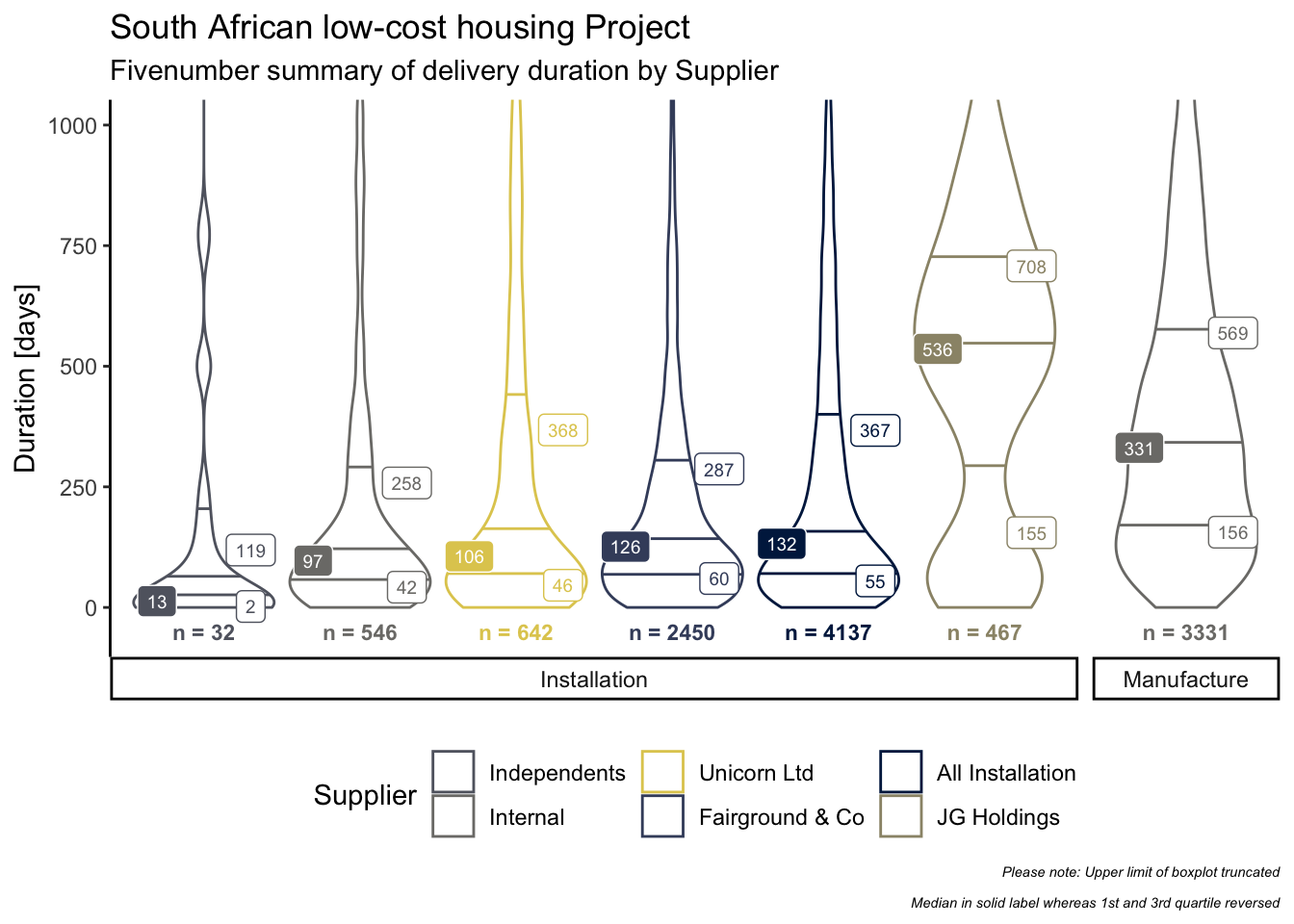
Visualising Statistics
Violin plots make it a lot easier to see the kurtosis and skewness by installation supplier. The fivenum summary better describes the distribution of the underlying data, in this case, allowing for a more robust comparison between the various suppliers.
plot_data <-
  df_duration %>%

  # filter to exclude unknown suppliers
  filter(Supplier != "Unknown") %>%

  # coerce duration data-type to integer
  mutate_at(vars(Duration), as.integer) %>%

  # nest data and pass to function, creating a tally for all installation
  # suppliers in addition to each supplier
  nest(data = everything()) %>%
  mutate_at(vars(data), purrr::map, function(df) {
    df %>%
      union_all(df %>%
                  filter(Milestone == "Installation") %>%
                  mutate(Supplier = "All Installation")) %>%
      group_by(Supplier, Milestone) %>%
      mutate_at(vars(Duration), list(median = median)) %>%
      arrange(Milestone, median) %>%
      ungroup() %>%
      mutate_at(vars(Supplier), fct_inorder) %>%
      return()
  }) %>%
  unnest(data)

plot_data_text <-
  plot_data %>%
  group_by(Milestone, Supplier) %>%
  select(-row_id) %>%

  # apply the summary function to extract the fivenum statistics
  do(fivenum = summary(.$Duration)) %>%
  head(10) %>%
  ungroup() %>%

  # tidy the output
  mutate_at(vars(fivenum), purrr::map, broom::tidy) %>%

  # gather the results
  mutate_at(vars(fivenum), purrr::map, gather) %>%
  unnest(fivenum) %>%

  # retain inter quartile range values/ boundaries only
  filter(key %in% c("q1", "median", "q3")) %>%
  rename(Measure = key, Duration = value)

plot_data %>%
  ggplot(aes(
    x = interaction(Milestone, Supplier),
    y = Duration,
    label = Duration,
    col = Supplier
  )) +
  geom_violin(draw_quantiles = c(0.25, 0.5, 0.75),
              scale = "width",
              trim = TRUE) +

  # plot the Q1 & Q3 stats
  geom_label(
    data = plot_data_text %>%
      filter(Measure != "median") %>%
      mutate_if(is.numeric, round),
    size = 2.5,
    nudge_x = 0.30,
    show.legend = FALSE) +

  # plot the median and reverse colour to accentuate
  geom_label(
    data = plot_data_text %>%
      filter(Measure == "median") %>%
      mutate_if(is.numeric, round),
    aes(fill = Supplier),
    col = "white",
    size = 2.5,
    nudge_x = -0.30,
    show.legend = FALSE) +

  # plot the volume by a supplier for each supplier at the base of the violin plot
  geom_text(
    data = plot_data %>% count(Milestone, Supplier),
    aes(y = 0, label = paste("n =", n)),
    nudge_y = -50,
    size = 3,
    fontface = "bold",
    show.legend = FALSE
  ) +

  # facet by Milestone
  facet_grid(. ~ Milestone,
             scales = "free",
             space = "free",
             switch = "x") +

  # set the presentation options
  scale_colour_manual(values = plot_data_viridis()$col) +
  scale_fill_manual(values = plot_data_viridis()$col) +
  coord_cartesian(ylim = c(-50, 1000)) +
  theme_classic() +
  theme(
    axis.line.x = element_blank(),
    axis.title.x = element_blank(),
    axis.text.x = element_blank(),
    axis.ticks.x = element_blank(),
    legend.position = "bottom",
    plot.caption =  element_text(size = rel(0.5), face = "italic")
  ) +

  # labelling
  labs(
    y = "Duration [days]",
    title = "South African low-cost housing Project",
    subtitle = "Fivenumber summary of delivery duration by Supplier",
    col = "Supplier",
    caption = "Please note: Upper limit of boxplot truncated\n
    Median in solid label whereas 1st and 3rd quartile reversed"
  )
Confirming differences
In the next code block, we are calculating confidence intervals for medians using the percentile bootstrap method. This allows us to compare the median duration of the suppliers, and to establish whether these typical durations are different enough to be statistically significant or not.
model_data <-
  df_duration %>%
  filter(Supplier != "Unknown") %>%
  mutate_at(vars(Duration), as.integer) %>%
  nest(data = everything()) %>%
  mutate_at(vars(data), purrr::map, function(df) {
    df %>%

      # create a union of all installation suppliers & milestones to calculate
      # and present the overall confidence interval along with the supplier
      # specific ones
      union_all(
        df %>%
          filter(Milestone == "Installation") %>%
          mutate(Supplier = "All Installation")
      ) %>%
      group_by(Supplier, Milestone) %>%

      # return the median per Supplier and for all Installation suppliers
      mutate_at(vars(Duration), list(median = median)) %>%
      arrange(Milestone, median) %>%
      ungroup() %>%

      # order Suppliers by the ranked median
      mutate_at(vars(Supplier), fct_inorder) %>%
      return()
  }) %>%
  unnest(data)

library(rcompanion)

df_duration_groupwise_median_ci <-

  # calculate the bootstrapped median and confidence interval for Duration,
  # grouped by Supplier and Milestone combinations
  groupwiseMedian(
    Duration ~ Supplier + Milestone,
    data = model_data,

    # 95% confidence
    conf = 0.95,

    # 5000 bootstrap iterations with resampling
    R = 5e3,
    digits = 3,
    percentile = TRUE,
    bca = FALSE
  )
plot_data <-
df_duration_groupwise_median_ci %>%
# filter to retain the Installation milestone only
filter(Milestone == "Installation") %>%
# arrange by median, ascending order
arrange(Median) %>%
mutate_at(vars(Supplier), fct_inorder, ordered = TRUE) %>%
filter(Supplier != "Unknown")
plot_data %>%
ggplot(aes(x = Supplier, col = Supplier)) +
# plot error bar with the lower and upper percentile values showing the
# confidence interval range
geom_errorbar(
aes(ymin = Percentile.lower, ymax = Percentile.upper),
size = 1.5,
show.legend = TRUE
) +
# plot the values for the upper and lower percentile values
geom_label_repel(
data =
plot_data %>%
select(Supplier, Milestone, starts_with("Percentile")) %>%
gather(key, value, 3:4),
aes(y = value, label = value),
size = 2.5,
segment.alpha = 0.5,
nudge_x = 0.5,
show.legend = FALSE
) +
geom_point(aes(y = Median),
size = 2,
col = "red",
show.legend = FALSE) +
geom_label(
aes(y = Median, label = Median, fill = Supplier),
nudge_x = -0.2,
size = 2.5,
col = "white",
show.legend = FALSE
) +
# set presentation options
scale_colour_manual(values = plot_data_viridis()$col) +
scale_fill_manual(values = plot_data_viridis()$col) +
theme_classic() +
theme(legend.position = "bottom") +
# labelling
labs(
x = "Supplier",
y = "Duration [days]",
title = "South African low-cost housing Project",
subtitle = "Median 95% Percentile Confidence Interval of delivery duration by Installation Supplier",
col = "Supplier"
)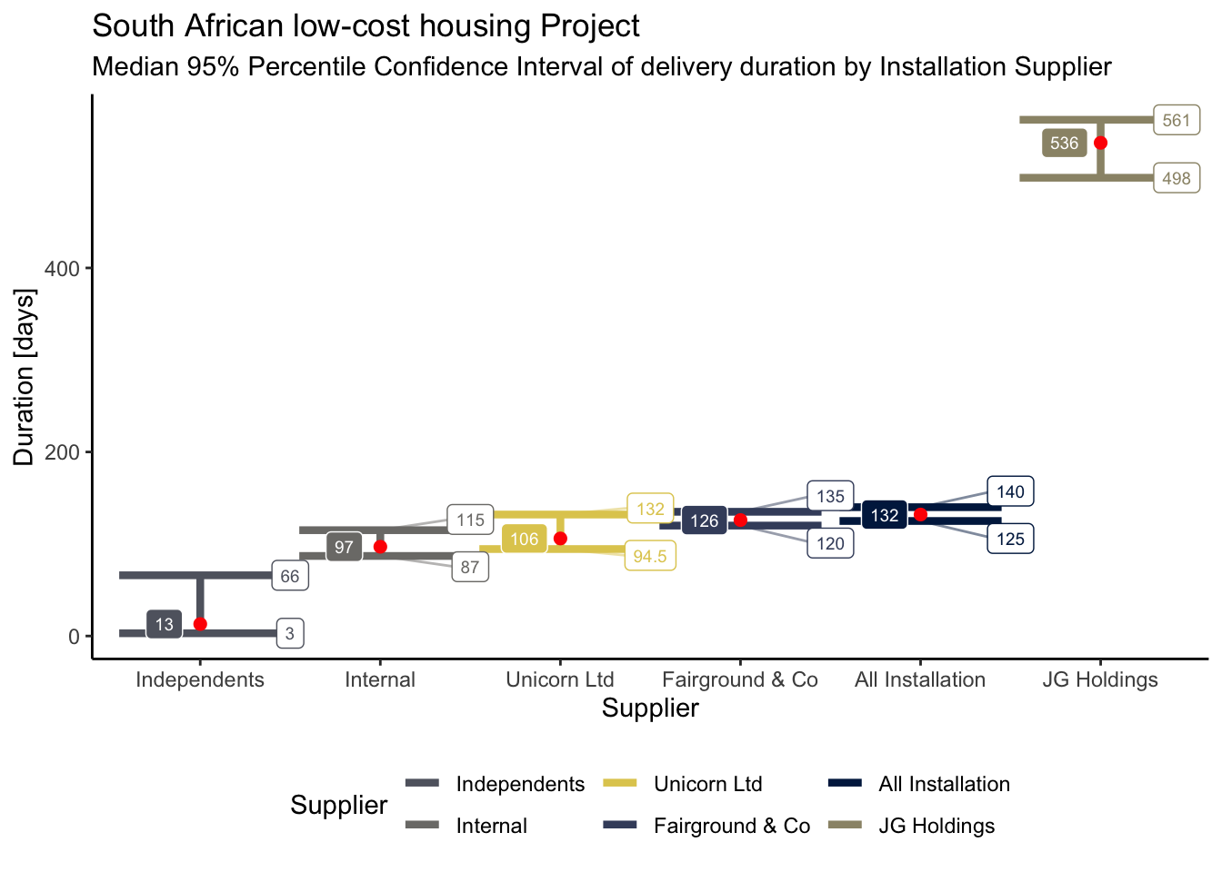
Independents and JG Holdings median durations are significantly different from the other Installation suppliers.
The Supplier Tenure section provides some interesting insights that explain the difference. Independents and JG Holdings had started much later in the programme, hence why the volume of delivery is significantly lower comparatively, all things being equal.
Projects delivered later in the programme are likely to be more problematic, a possible explanation of why JG Holdings took longer to complete activities. Worth investigating this hypothesis in the future.
Independents, on the other hand, are made up of small outfits, making them lean and agile compared with larger suppliers, who in turn can scale significantly more.
Summary
The analysis demonstrated in this case study is not comprehensive and exhaustive but provides an overview of useful functions to analyse and report state changes of large-scale programmes over time.
Session Info
## R version 3.6.2 (2019-12-12)
## Platform: x86_64-apple-darwin15.6.0 (64-bit)
## Running under: macOS Catalina 10.15.3
##
## Matrix products: default
## BLAS:   /Library/Frameworks/R.framework/Versions/3.6/Resources/lib/libRblas.0.dylib
## LAPACK: /Library/Frameworks/R.framework/Versions/3.6/Resources/lib/libRlapack.dylib
##
## locale:
## [1] en_GB.UTF-8/en_GB.UTF-8/en_GB.UTF-8/C/en_GB.UTF-8/en_GB.UTF-8
##
## attached base packages:
## [1] stats     graphics  grDevices utils     datasets  methods   base
##
## other attached packages:
##  [1] psych_1.9.12.31 mapdata_2.3.0   maps_3.3.0      ggrepel_0.8.1
##  [5] knitr_1.28      readxl_1.3.1    lubridate_1.7.4 forcats_0.4.0
##  [9] stringr_1.4.0   dplyr_0.8.4     purrr_0.3.3     readr_1.3.1
## [13] tidyr_1.0.2     tibble_2.1.3    ggplot2_3.2.1   tidyverse_1.3.0
##
## loaded via a namespace (and not attached):
##  [1] Rcpp_1.0.3        lattice_0.20-40   zoo_1.8-7         assertthat_0.2.1
##  [5] digest_0.6.24     utf8_1.1.4        plyr_1.8.5        R6_2.4.1
##  [9] cellranger_1.1.0  backports_1.1.5   reprex_0.3.0      evaluate_0.14
## [13] httr_1.4.1        highr_0.8         blogdown_0.17     pillar_1.4.3
## [17] rlang_0.4.4       lazyeval_0.2.2    rstudioapi_0.11   rmarkdown_2.1
## [21] labeling_0.3      webshot_0.5.2     selectr_0.4-2     munsell_0.5.0
## [25] broom_0.5.4       compiler_3.6.2    modelr_0.1.5      xfun_0.12
## [29] pkgconfig_2.0.3   mnormt_1.5-6      htmltools_0.4.0   tidyselect_1.0.0
## [33] gridExtra_2.3     bookdown_0.17     fansi_0.4.1       viridisLite_0.3.0
## [37] crayon_1.3.4      dbplyr_1.4.2      withr_2.1.2       grid_3.6.2
## [41] nlme_3.1-144      jsonlite_1.6.1    gtable_0.3.0      lifecycle_0.1.0
## [45] DBI_1.1.0         magrittr_1.5      scales_1.1.0      cli_2.0.1
## [49] stringi_1.4.6     farver_2.0.3      reshape2_1.4.3    viridis_0.5.1
## [53] fs_1.3.1          xml2_1.2.2        ellipsis_0.3.0    generics_0.0.2
## [57] vctrs_0.2.3       kableExtra_1.1.0  tools_3.6.2       glue_1.3.1
## [61] hms_0.5.3         parallel_3.6.2    yaml_2.2.1        colorspace_1.4-1
## [65] rvest_0.3.5       haven_2.2.0
y always increases when x increases and y always decreases when x decreases↩︎